The 2022 Beijing Olympics
We take a look at the branding behind The 2022 Beijing Olympics
The 2022 Winter Olympics in Beijing, the Chinese capital, is the first city in history to have hosted both the summer and winter games.
We take a look at the branding behind the event, designed by artist Lin Cunzhen.
Emblem

Designed by artist Lin Cunzhen, the Beijing 2022 emblem combines traditional and modern elements of Chinese culture, as well as features embodying the passion and vitality of winter sports.
Inspired by 冬, the Chinese character for “winter”, the emblem resembles a skater at the top and a skier at the bottom. The flowing ribbon-like motif between them symbolises the host country’s rolling mountains, Olympic venues, ski pistes and skating rinks. It also points to the fact that the Games will coincide with the Chinese New Year.
The use of blue in the emblem represents dreams, the future and the purity of ice and snow, while red and yellow – the colours of China’s national flag – symbolise passion, youth and vitality.
Slogan
“Together for a Shared Future” is the official motto of the Olympic and Paralympic Winter Games Beijing 2022.
The motto represents the power of the Games to overcome global challenges as a community, with a shared future for humankind. The words reflect the necessity for the world to work together towards a better tomorrow, especially given the difficulties faced throughout the COVID-19 pandemic.
“Together for a Shared Future” demonstrates unity and a collective effort, embodying the core values and vision of the Olympic Movement, and the goal of pursuing world unity, peace and progress. The motto considered the key values of the Paralympic Games, in particular, the role they play in contributing to a more inclusive society.
It was selected after an extensive process between May and September 2020. During this period, Beijing 2022 collected 79 motto proposals from Chinese universities, of which 11 were shortlisted by experts from various fields.

Posters
The Organising Committee of the Olympic and Paralympic Winter Games Beijing 2022 released a series of official and promotional posters at the opening ceremony of the 2021 Beijing Design Week. Three sets of official Beijing 2022 posters feature the Games’ emblem and mascots, while 11 promotional posters were selected from among thousands of entries received for a design competition.
The Beijing 2022 posters feature various elements of winter sports as well as Chinese culture, and highlight the Beijing 2022 motto "Together for a Shared Future”.
For the promotional posters, the Beijing 2022 Organising Committee had launched a public call for submissions during the Beijing International Design Week last year. More than 1,500 entries were received from hundreds of design institutions, professionals, design school teachers and students.
The final 11 promotional posters depict various elements of the Olympic Winter Games, Chinese culture, winter sports in society and Beijing cityscapes.
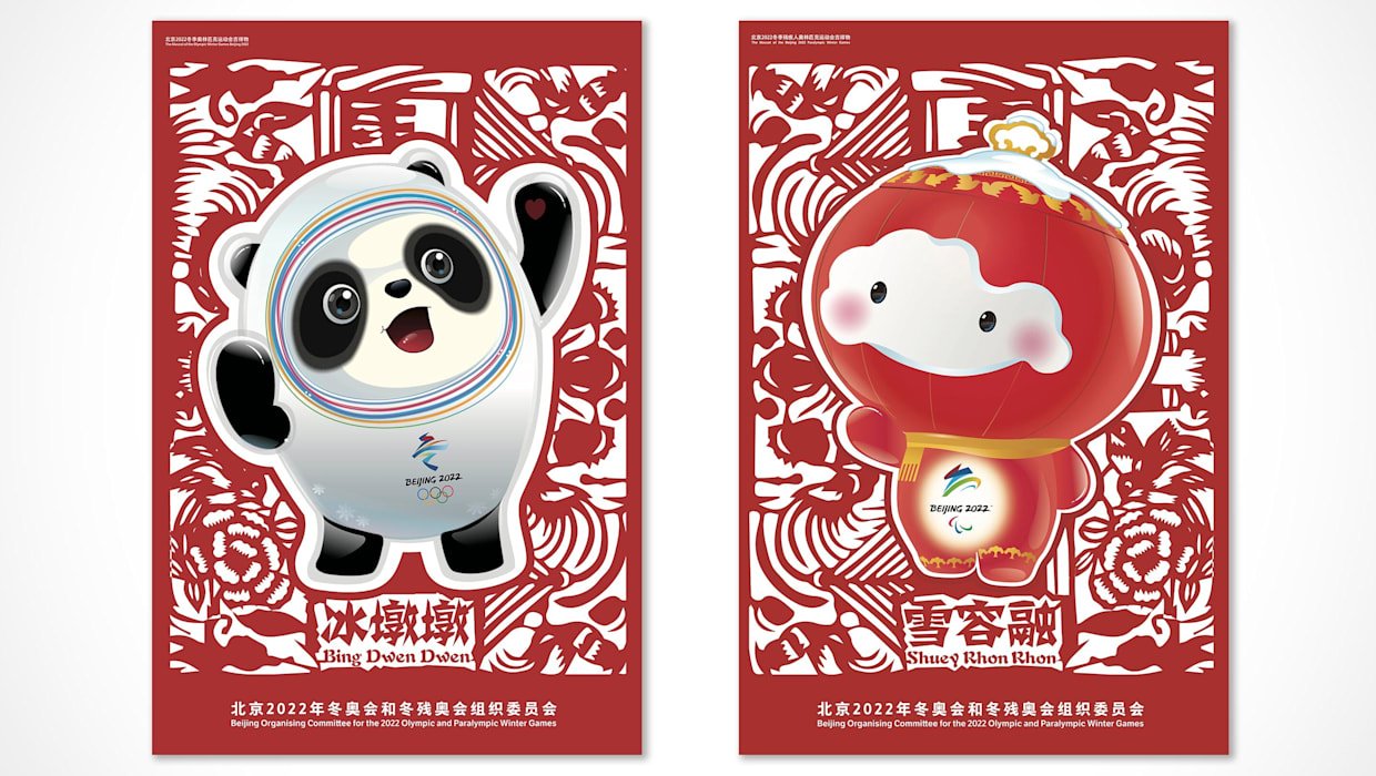
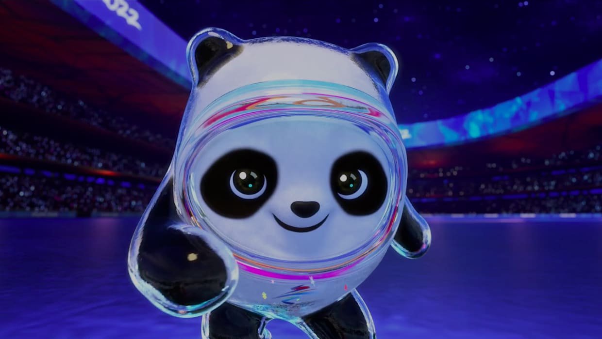
Mascots
Illustrator and designer Cao Xue has created the 2022 mascot, a lively panda named Bing Dwen Dwen (Bing means ice in Chinese, while Dwen Dwen means robust). Bing Dwen Dwen is decked out in a full-body shell – resembling an astronaut suit – which is a “tribute to embracing new technologies for a future with infinite possibilities”, says the IOC.
The panda’s future-facing potential is emphasised by the rainbow-coloured halos which wrap around its face. Though the animal was chosen from almost 6,000 submissions, it shouldn’t come as too much of a surprise that a panda was chosen – the giant panda is China’s national animal (and was also one of the five mascots at the 2008 Games).
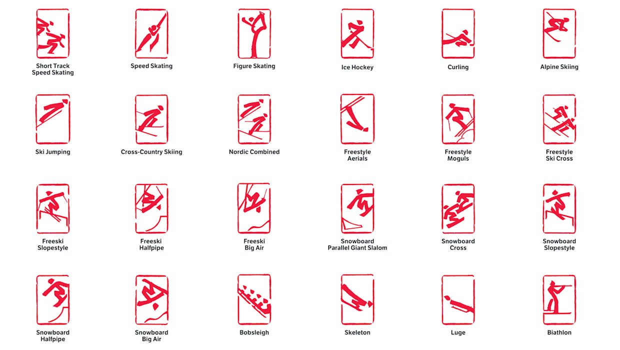
Pictograms
The 24 pictograms for the Winter Olympics blend traditional Chinese graphics and the diversity of winter sports, explains the IOC. Freestyle skiing has been allotted six icons thanks to the range of equipment used. The designs are based on seal engraving – in each, the sport is represented with strokes characteristic of Chinese seals which date back centuries. “The sharp contrast between the red background and white strokes also highlights the grace and dynamism of winter sports,” organisers added. The pictograms have been crafted by a group of designers led by Lin Cunzhen.
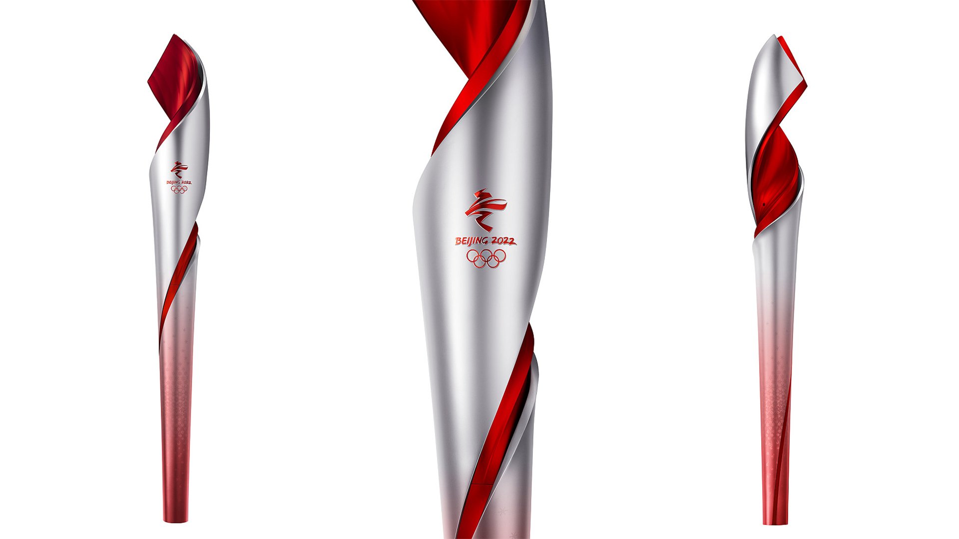
Torch
The red and silver torch, designed by Li Jianye, nods to its counterpart at Beijing’s Summer Olympics. “By using the same colour combination and by sharing similar artistic elements with the 2008 torch, we aim to extend auspicious greetings to the world as we did at the Summer Games,” Li says. The torch’s ribbon-like structure, itself a nod to 2008’s scroll-like cauldron, allows carriers to lock together the two torches. It also uses hydrogen fuel, meaning that it is emission-free. Owing to a number of Covid cases in China, the torch relay has been shortened to just three days.
Source: IOC